Designing the whole page builder
I created the system behind the MaxiBlocks editor, and we worked with it for five years as the product and its design library grew. It gave the interface, foundation blocks, original icons and global styles a shared structure.
- My responsibility
- Co-founder, Product Owner & Design Lead
- Design system
- Foundations, reusable controls, block interfaces, original icons and global styles
- Timeline
- Started February 2020 · Public launch April 2023
The difficulty came from real customer work
Before MaxiBlocks, I designed website templates for Divi Den and built client sites. Customers loved the designs, but adapting them often meant working with CSS and classes. Support requests showed us that a good starting layout was only useful if people could make it their own.
When Gutenberg arrived, we planned our own builder around those questions. My Photoshop workflow helped shape the direction: make a page with text, images, simple shapes and freedom to arrange them. We chose a responsive grid and a smaller set of capable foundation blocks instead of a long list of specialised ones.
A design system we worked with for five years
A page builder needs hundreds of decisions to feel related: how a field is labelled, where a reset sits, how selected states look, how controls are grouped and what changes at each breakpoint. I designed those relationships as a system, so a person moving from a text block to an image or container could recognise the controls and keep working.
We used that system in our own work for five years. Designing patterns and complete pages meant working with the same blocks, settings and Style Cards as our customers. The library and the editor developed together; a new layout could reveal where a control needed clearer wording, a different state or another option.
From foundations to the smallest control
I built the visual language around readable typography, consistent spacing, clear borders and Maxi's green selected states. Those foundations carry through to the fields, tabs, accordions and actions used throughout the inspector.
- Typography and spacing
- A clear heading hierarchy, a repeatable spacing rhythm and field labels that remain visible while someone edits a value.
- Colour and surfaces
- Neutral working areas keep attention on the page. Colour identifies selected controls and connects the editor to the MaxiBlocks identity.
- Reusable controls
- Number fields, unit selectors, sliders, toggles and reset actions share familiar behaviour. Each block uses the controls its content requires.
- States and responsive rules
- Normal and hover states sit alongside six breakpoint choices. Designers can refine a specific screen size within the same control structure.
- Block interfaces
- Settings, Canvas and Advanced groups bring the shared controls into the context of each block, from text and images to containers, sliders and maps.
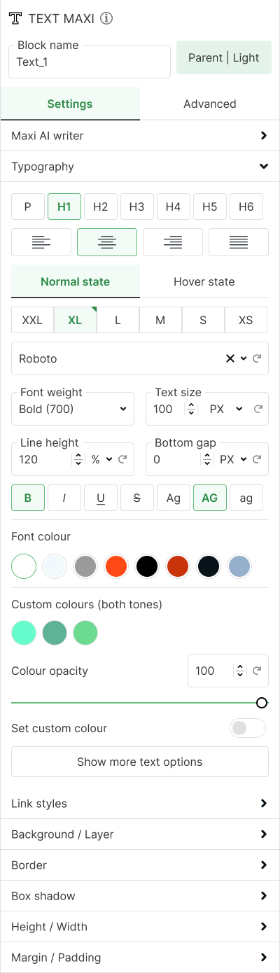
The typography inspector brings those decisions together: floating labels, numeric inputs, units, alignment, font styles and colour selection all belong to the same family.
Original icons, with a job to do
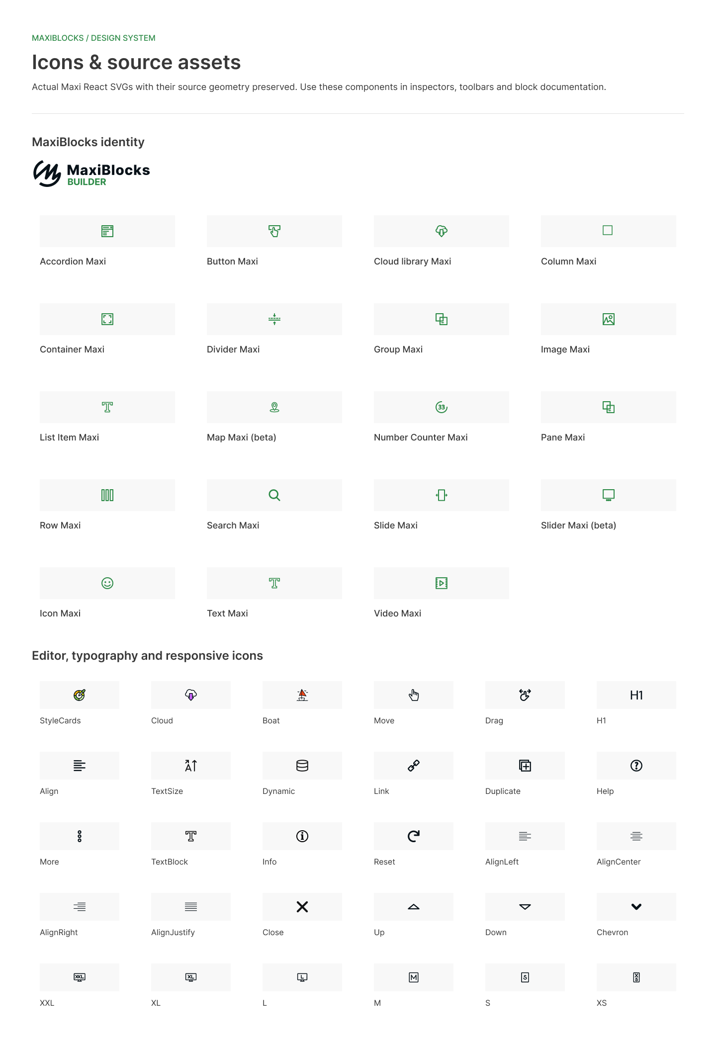
I designed the original interface icons as part of the product language. They help people recognise blocks in the inserter, understand actions in the toolbar and find familiar controls in the inspector. Their line work, scale and colour needed to make sense together in a dense editing interface.
The current Figma library keeps the source SVG geometry and Maxi colours. Block icons, editor actions and responsive symbols are documented together, so the same asset can be reused wherever that meaning appears in the product.
The system, documented in Figma
This Figma file documents the system we developed and used over five years. The current library brings its foundations, assets, controls and block interfaces together in an organised reference. It preserves the product's existing visual language and connects the shared components to their examples.
Colour and surfaces, layout and spacing, content and media, and data and interactions each have named sections. All nineteen block pages link to their relevant controls. A shared component is documented once, making it easier to understand how the same decisions carry across the editor.
A workspace for the whole page
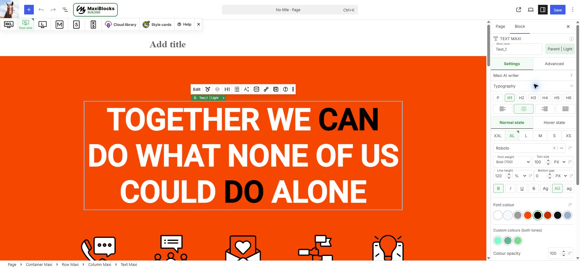
I designed the interface so the page stays in view while you work. The canvas shows the result; a contextual toolbar handles the selected element; the inspector groups deeper settings such as typography, background, border and spacing. The block path makes the nested container, row, column and element structure easier to follow.
That structure supports expressive layouts without asking people to begin with code. Text, icons and buttons live inside flexible rows and columns, while the controls stay close to the part of the page you are changing. The same approach guided the original icon set and the way the editor presents its many options.
Responsive design in the editor
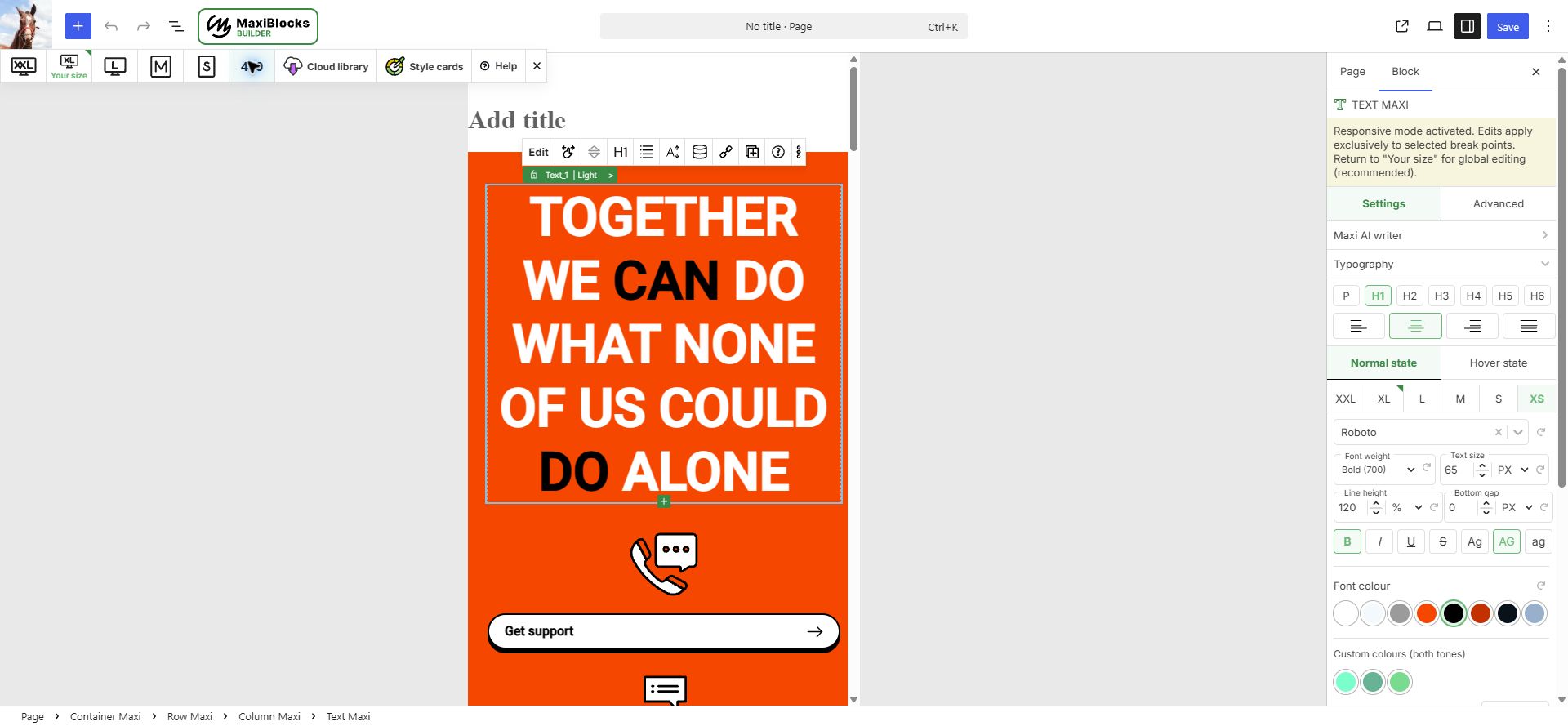
The breakpoint bar makes screen size part of the normal workflow. A designer can work at the current width, then switch among six responsive sizes and refine a smaller layout in context. The inspector shows which size is active, so a local adjustment is distinct from a global one.
That mattered to me because a desktop composition is only one version of a page. I designed and checked layouts across the same breakpoints the builder gives its users.
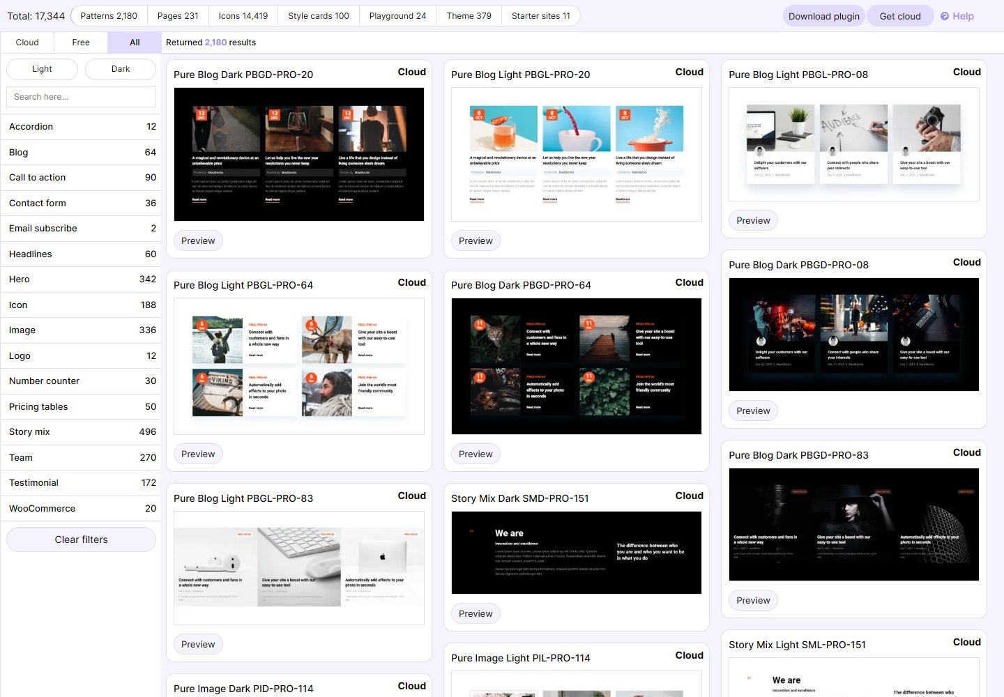
Find a starting point in the Cloud library
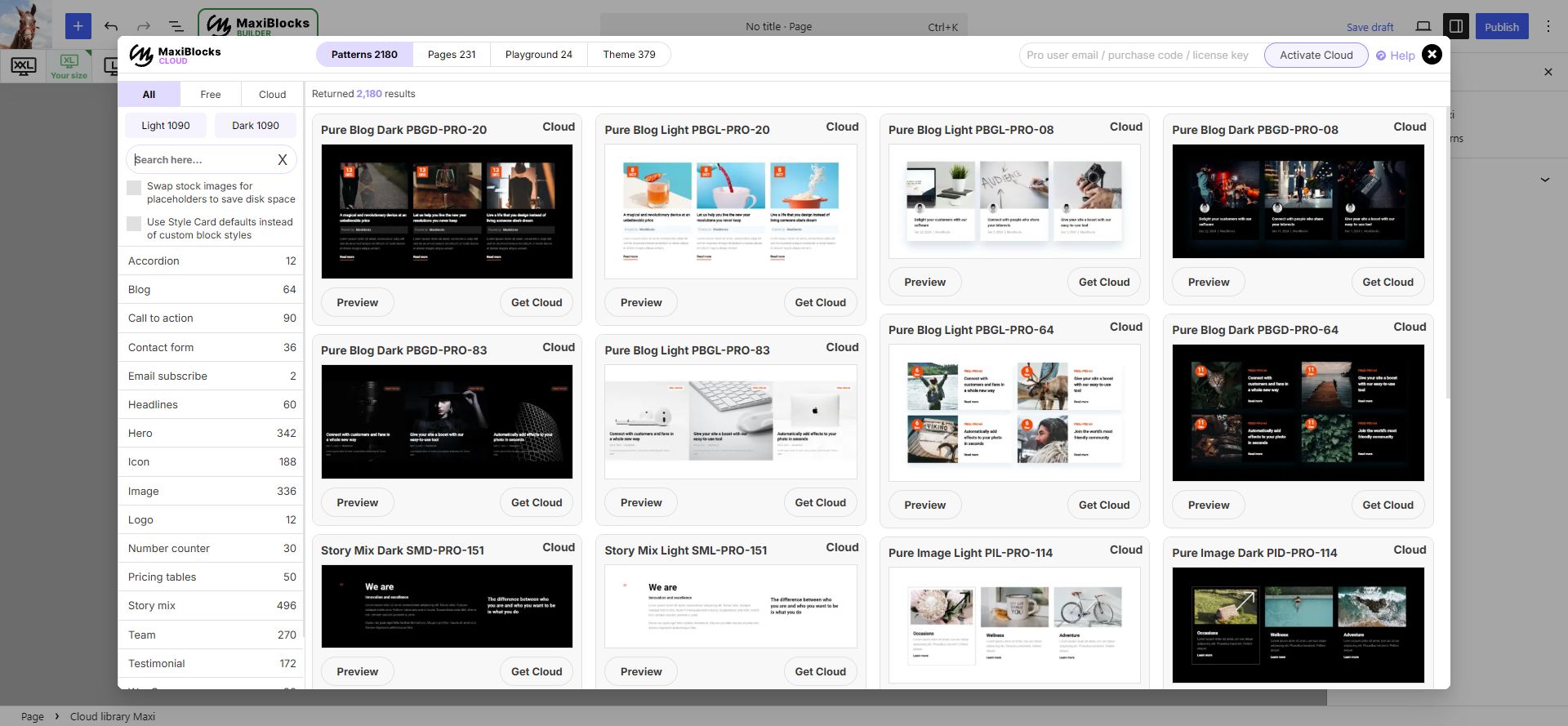
People can browse patterns, pages and themes from inside the editor. Categories, search and light or dark filters help narrow the library; previews let someone inspect a design before using it. The library was built with the product, so every new pattern also exercised the controls our customers would use.
Style Cards make the look easier to change
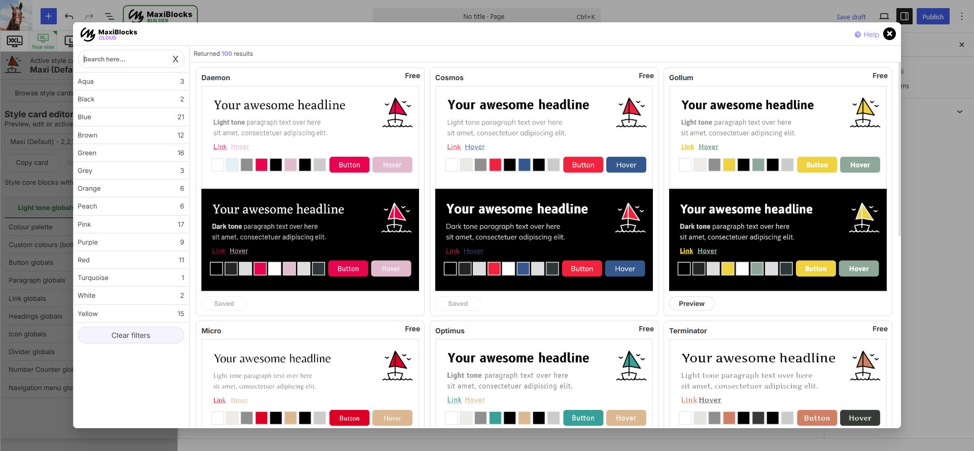
One question came up repeatedly in support: how do I change the colour? We started with global styles before building the rest of the editor. Christiaan named Style Cards and proposed browsing them. I designed the global styling approach around that support problem and carried it through the builder.
A Style Card brings typography, colour, links and buttons into one editable system for a website. That extends the same thinking to the pages people create: shared rules can carry through many blocks and layouts, while individual content stays editable. Our team used Style Cards alongside the interface system when building the design library.
- BrowseCompare light and dark tones, colour, type, links and buttons together.
- Copy and adjustMake a personal version and edit the system in one place.
- ActivateApply the chosen look across MaxiBlocks elements on the site.
Designing with the development team
As Product Owner and Design Lead, I turned customer feedback into requirements, planned features and reviewed releases with the developers. Svitlana led the engineering team. The front-end team built patterns with the same tools customers would use; that work exposed missing controls and bugs as the builder grew.
I designed the interface, original icons and layouts across six breakpoints, tested branches locally and passed fixes to senior developers for review. Over five years of working with the system, we returned to the same shared rules as features and designs evolved. The flexible grid and foundation blocks kept the editor tied to what the design team actually needed to make.
What shipped
The WordPress builder launched publicly in April 2023 with an editable canvas, responsive controls, foundation blocks, Style Cards and a growing library of patterns, page layouts, icons and shapes. The design system I created provided the shared language behind that work. Five years of using it connected the interface decisions to the daily practice of making websites.
Story and role details: my article and CV. Interface screenshots: the MaxiBlocks test editor, captured 30 September 2026. Design system examples: the current Figma documentation, captured October 2026.